


My garden is decidedly orange at the moment. Orange Acer, orange Parthenocissus, orange Anigozanthos, orange Clivia, orange Banksia, orange, well, oranges, even!

Oranges in my garden
Orange is a colour that frequently polarises; it’s probably the one that most clients say ‘anything but’ about. And yet it is an exuberant, youthful, adventurous, energetic, healthy, fun, exciting, warm, confident, cheerful, stimulating colour. Which all sounds pretty good. The negative connotations, however, are lacking seriousness, being flamboyant and signifying low class or cheapness.
But hang on a minute. Lacking seriousness and being flamboyant sound like two pretty positive garden characteristics to me. So we’re left with the question of cheapness. Easyjet does pop into my mind.
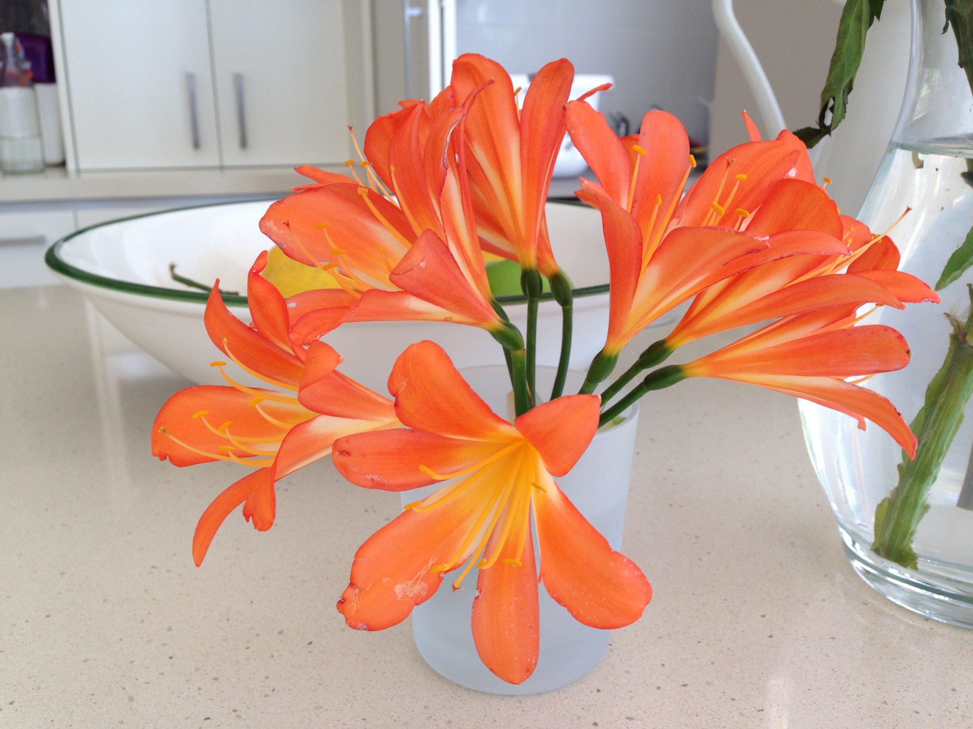
The insipid, fluorescent orange of Clivia miniata
I think this is the crux of the matter. There are oranges and oranges. I’m having a ‘cheapness’ issue with my Clivia at the moment. Or at least a brashness one. I love the foliage but that orange of the standard Clivia miniata repels me more and more each year. It’s insipid, almost fluorescent; this is not a sophisticated colour to my eye.

Autumnal Acer leaves in my garden
But should we tarnish all oranges with this label? Think of the more earthy shades. Autumn leaves, the flames of a fire, a beautiful sunset, Banksia cones, the patina of copper or the fieriness of saffron. Such gorgeous, natural, healthy colours, many caused by important protectant pigments, carotenoids.
There is a generic design ‘rule’ that says there are no bad colours, only bad colour combinations, along a similar line to my view that there are no bad plants, only bad places to plant them. So I was thinking about the colour combinations where I think orange looks particularly stunning.
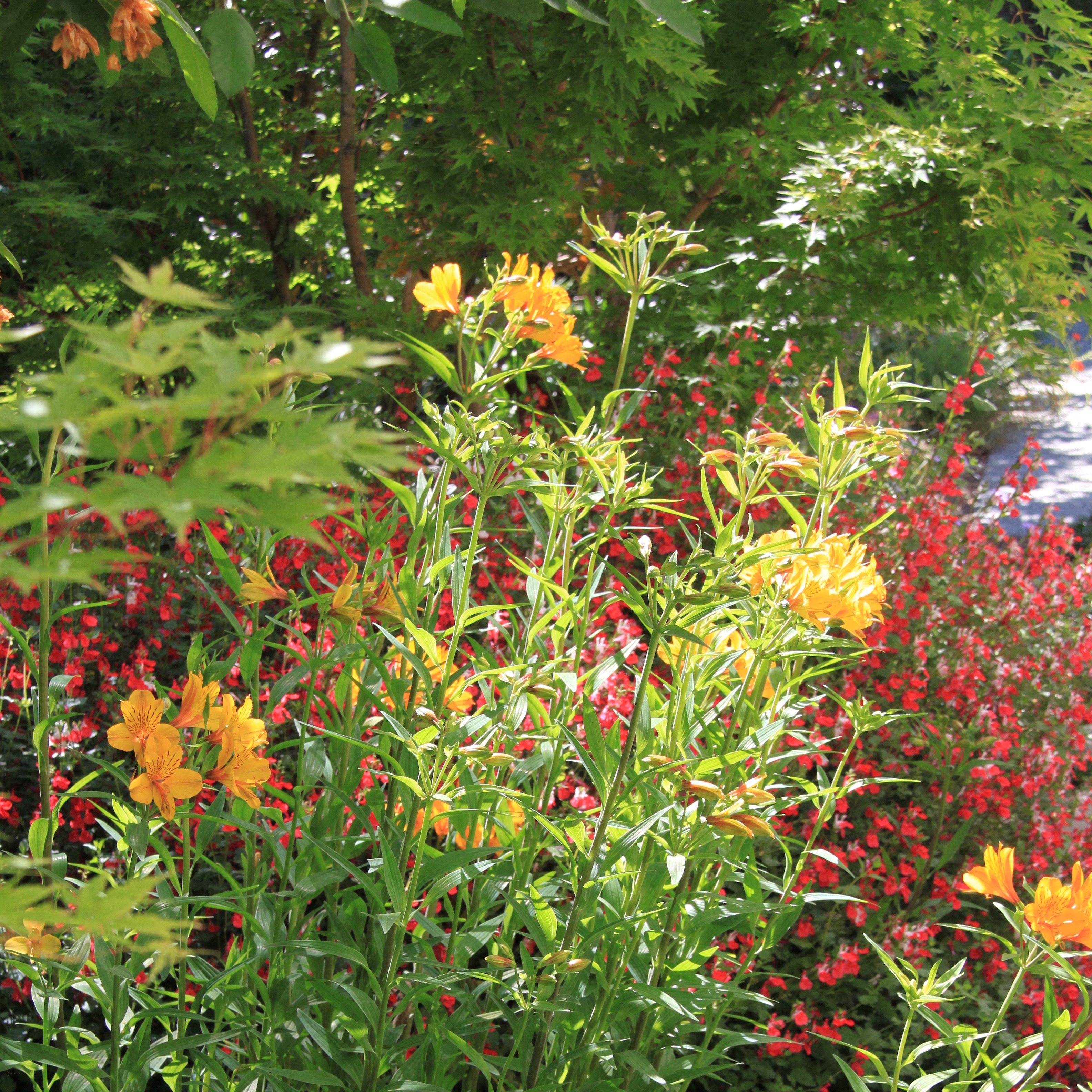
1. Green, purple, orange

Blue Hydrangea and orange Canna balanced with green foliage in this Mosman garden. The burgundy also adds an interesting dimension
Green, purple and orange are the three secondary colours: the products of mixing two primary colours. Seen together, green, purple and orange balance and stabilise each other; they have less tension than complementary colours (opposite on the wheel colour) and yet are still visually exciting. This ‘triangle’ of colours (as positioned on the colour wheel) works particularly well when one of the three is dominant, in our case usually the grounding green of foliage. It was surprisingly hard then, to find any photos of this combination, amongst my thousands of library pictures. I have recently planted a purple Salvia next to an orange Leonotis and lush green Crinum in my garden…but I’m still waiting for the Leonotis to flower.
2. Brights
Pure, bright colours really ‘zing’ in Adam Frost’s Homebase Chelsea 2015 garden. Photo: The Frustrated Gardener
Mixing a whole range of bright, pure, unmuted colours has a wonderfully uplifting effect. Coming from the same, outer ring of the colour wheel, unadulterated by white or black, the colours have a connection that ties them all together. With all pure hues, it’s surprising how fabulous seemingly clashing colours look together. Magenta and orange? No problem. You can even add a pure white to the brights – it makes the colour pop even further – but it must be a pure, pure white or the colour connections break down.
Bright colours in Mary’s Place, Hawera work well together
This mix of bright orange with paler creams, whites and various pinks just doesn’t hang together so well for me
3. Hots
Hot colours of The Cottage Garden, Sissinghurst, last autumn
It’s also common to see ‘hot’ garden beds; mixtures of yellows, oranges and reds. These are known as analogous colour combinations – those next to each other on the colour wheel. Here it is often best to use ‘tints’ of each shade: the pure colour muted with a splash of white or even ‘tones’, with grey added, or the look can be a little harsh. It is surprisingly hard to combine colours once you get into tints and tones – easy to see which ones look bad when they are all in place, but far harder to make that call when buying an extra plant at the nursery!
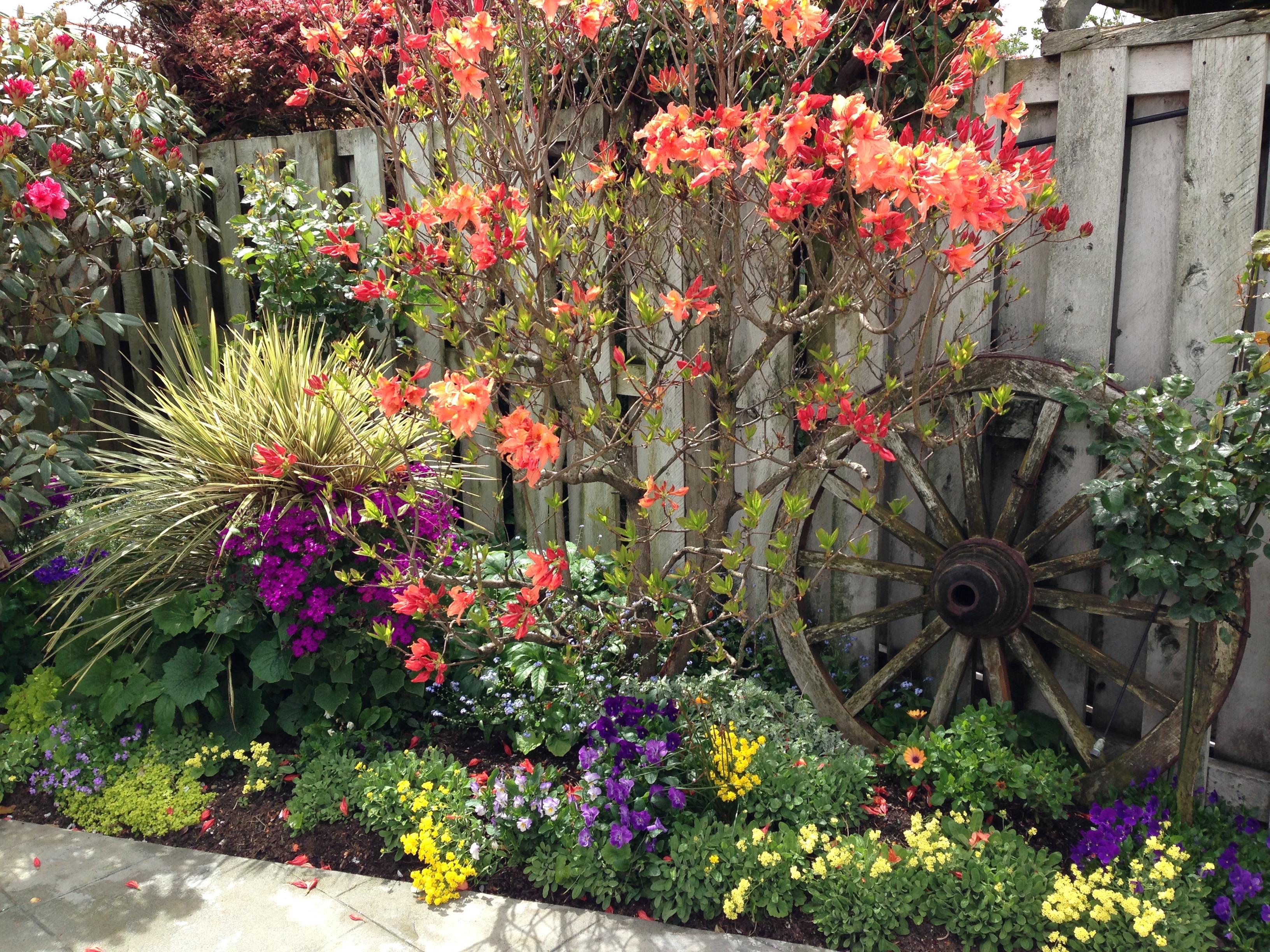
Hot reds and oranges in my Canberra garden
4. Harmony
Which brings me to the final point. Harmony. We are always searching for that perfect point between contrast and harmony. Because orange is an attention grabber (it’s even said to increase oxygen supply to the brain), it does need to be used with care. For me, Matthew Keightley’s Chelsea 2015 garden had orange that was too dominant amongst its neighbours. It made it hard to see the whole as the orange drew your eyes away every time. This can be resolved, as Dan Pearson did, by having less intense orange blocks, or it can be settled by integrating other strong aspects that compete equally with each other.

These oranges just jump out too much for me. Photo: The Frustrated Gardener

Less dense orange, mixed with other strong colours, looks absolutely stunning in Dan Pearson’s harmonious 2015 Chelsea garden. Photo: Ursula Williams
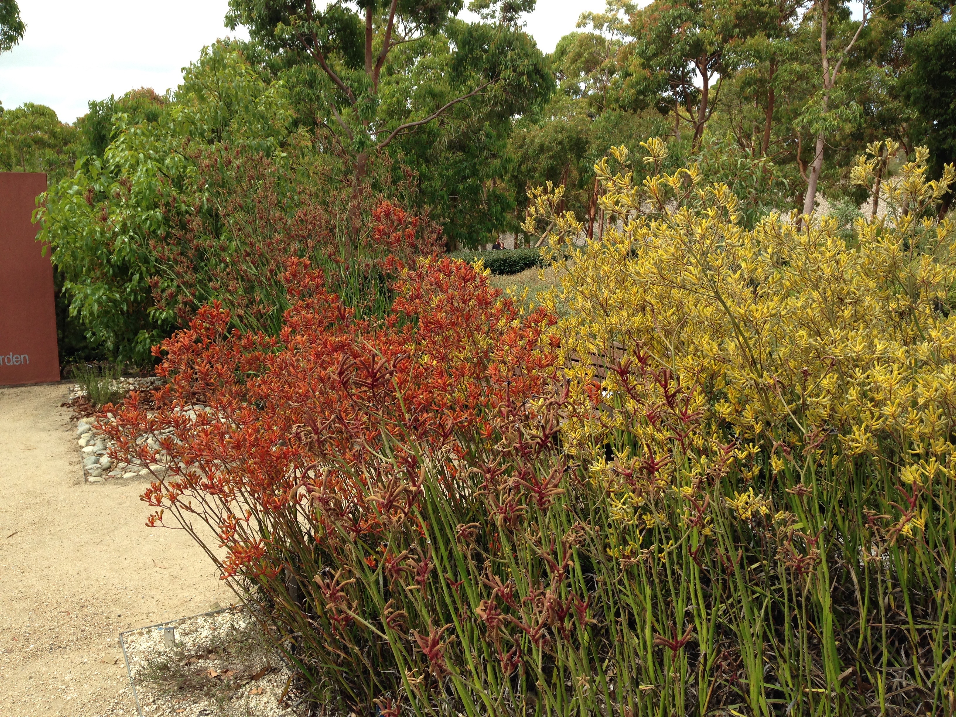
To me, one of the most harmonious uses of orange is in Australian native gardens. Orange colours tend to be muted and less intensely clumped, mixed up amongst many other colours. Orange-looking flowers are often actually a mix of yellow and red, forming quite a complex orange glow, and bark often flakes to reveal oranges amongst browns and greys and beiges. Repeated in different forms, native oranges bring real warmth to the typically grey-green foliage of many species, without being overly dominant or ‘blocky’.
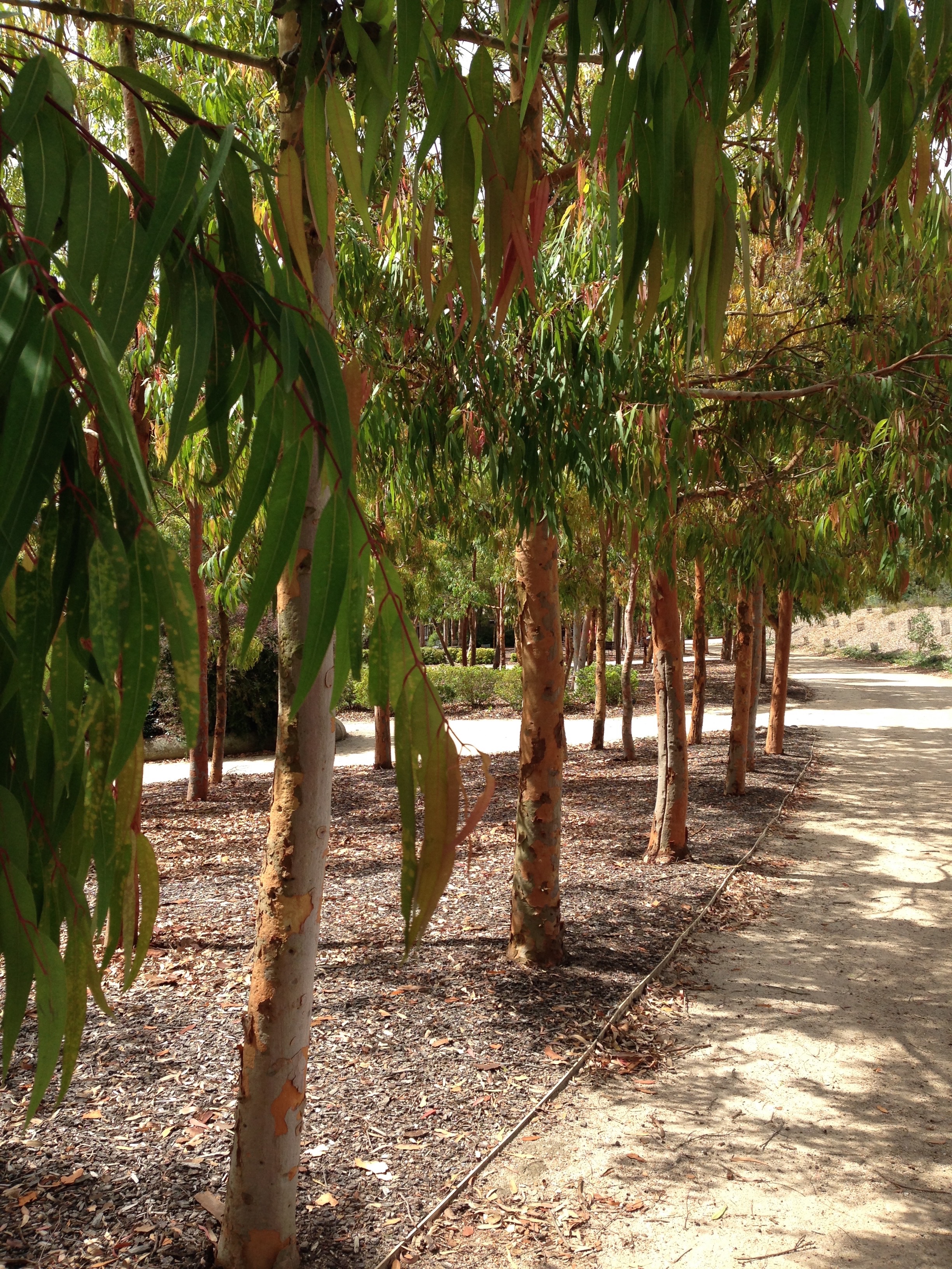
Such natural orange colours in these gum trees
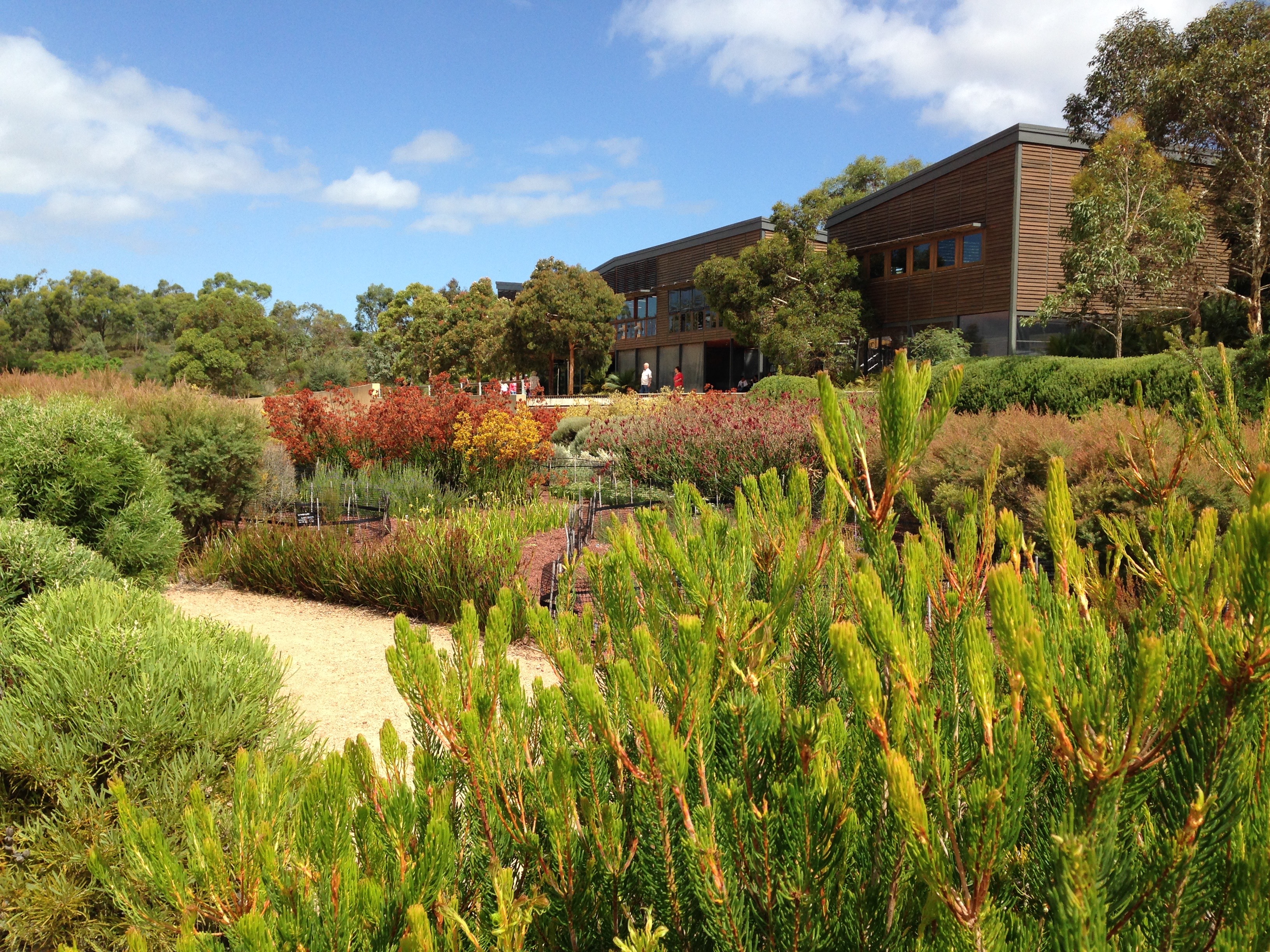
Many muted orange tones blend perfectly at the Royal Botanic Gardens Cranbourne
And so we are left with a few loose ends. Firstly, is there a place for the fluorescent Clivia miniata orange? I guess there is, although I’m struggling to come up with one. I can’t think of a situation, putting cost aside, where I wouldn’t prefer the shades of the Clivia hybrids. Maybe the right place for it is somewhere in the 1970s or perhaps the 2030s? Maybe it’s just out of fashion right now, but has a place in the future.
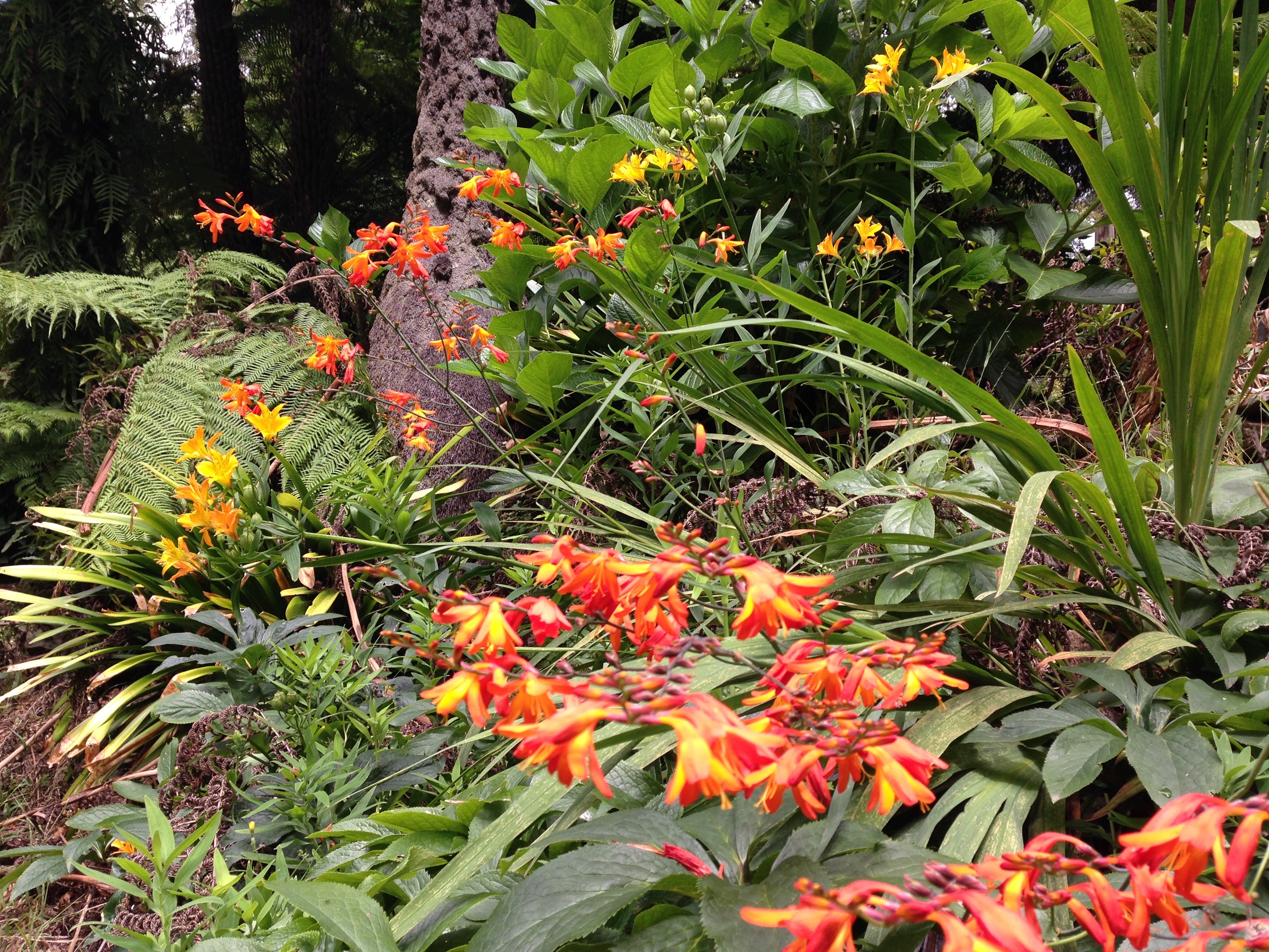
Hot Crocosmia and Alstroemeria colours in the Dandenong Ranges can’t help but brighten your day!
Secondly, are the brightest oranges just for the tropics and subtropics? It is often said that pastels are better for temperate gardens and brighter shades for hotter climates. Well, Chelsea and Sissinghurst can’t both be wrong; both with abundant orange plantings. But it isn’t necessarily the best colour for a relaxing area, designed for high dwell time. Chelsea and Sissinghurst both delight the viewer as they pass by, but we do need to think about the mood we are trying to create in a particular area. This applies equally to temperate and tropical gardens.
Overall, in the right place, I like to think of orange as the energy of red with the happiness of yellow. What are your thoughts?
Beautiful, earthy shades of Anigozanthos at Cranbourne. If you look closely you can see multiple colours make up each flower head. Its loose form and muted colours help avoid a ‘blocky’ look


Adding to Chelsea & Sissinghurst is Great Dixter – always big on the oranges.
I really like orange….and I understand your thoughts on Clivia, but it is a plant for deep shade.
To me the pale fluro orange in the shade setting works well, where almost nothing else grows, but not so well when placed in bright light!
But it can be difficult to find something to pair it with.
When I lived in Sydney (it’s a real struggle to grow it here) I grew it with shade tolerant pale violet flowers: things such as ornamental oxalis, clovers, etc, which were low growing and could sit at the edge of the clivia clump. Or you could take it up a notch with something like Tradescantia pallida…..that would spark a conversation!
One thing is for sure, the burnt oranges of aussie natives are very easy on the eye 🙂
Yes, I think Great Dixter as a whole can be summed up by that list of positive orange adjectives! I think I’m partly put off Clivia because there are just so many of them around here. They are clearly very well suited to our climate but sometimes, especially when you see them caterpillar-ravished in neglected gardens, you just groan and long for something different!
To be honest, my favorite garden there was the one that you felt the orange jumped out too much. I came here with some concerns that I have too much color going into my second-year garden, so we’ll see, but the dominant undertone in my home is a muted orange, and it really works with the home, and I wanted to mirror that outside. This year will be a marked change becase much of my first year garden was annuals, so I can shift the dominant colors as I enter year 2. There’s acres of green surround it so I am hoping it won’t be too much, but orange will be the anchor color that ties all the spaces together. I’m trying to create a garden that shifts from mostly blue in the spring with yellow as the secondary color and pops of orange, to one that is yellow and orange in the summer in the summer, with pops of dark blue and red. I haven’t thought too far into autumn and I have a few structure plants for winter. We shall see if it is a success or failure. I do like color.
I hope orange isn’t cheap because I’m bought into it large scale! I agree some of the very bright examples possibly are and they certainly need to be matched by plants with a similar colour ‘weight’ or they stand out like a sore thumb, as you’ve observed in one of the Chelsea gardens. I am using them in more muted shades, even combined with pink, in a mixed planting on the bank. Here I need colours that stand out, given the size of the area and the fact that it tends to be viewed from a distance. I’ve used the Geum ‘Totally Tangerine’ with a vibrant blue and that seems to work as well. Personally, I like orange!
Thanks Jessica; we definitely think along exactly the same lines when it comes to garden design! Your bank is looking absolutely stunning; I do hope your fall hasn’t set you back too much. Also hope things didn’t fry yesterday; anything over 35 and we get widespread sun scorch, so I dread to think what happens to unacclimatised plants…
I agree that the usual clivia colour can be a bit wishy-washy, and in recent times I have gone for the Belgian hybrids that have a stronger, richer colour. I usually pair them with other hot colours flowering at the same time in shade so that they aren’t in isolation – I love them with Justicia rizzinii for example. The yellow-flowered clivias grow well and they look fab with blue flowers and creamy-variegated foliage. I like the nodding version of clivia too. But I am grateful to the old faithful clivia for putting up with deep shade …
We’re just too spoilt! It is definitely a first world problem of mine to complain about the exact shade of petals on a plant that flowers its heart out on and off throughout the year in impossible soil and no sun. Your plant combinations sound absolutely divine – you have such a good eye – I’d like to try both.
I am in agreement with your other repliers. I like orange. However, it certainly needs a bit of thought in placement. Your photo of C. miniata clearly shows up its fluro characteristics but in deep shade in a block of green I think it adds sparkle. If it flowered too prolifically I would thin out the flowers but on my spartian watering and feeding program I never have that problem. Having said that, my Clivias are largely C. nobilis which are a more subdued orange-red. The orange flowers I don’t like are those that grow in bright light and create big blocks like orange gazanias and Californian poppies. These spring flowerers coincide when there is lots of bright, even harsh light, here in WA. However I quite like Pyrostegia venusta when it flowers in winter against a dark stormy sky. I feel when people won’t grow a group of plants like orange or Australian or succulents or even varigated (which I claim I don’t like but have many in my garden) they really cut themselves short and limit the potential of their garden.
Ew, orange Gazania. They are so nasty! And yet the cream and pink I just love. And I do like bright Pyrostegia. They are great examples of very emotive plants for me. It’s funny the associations you make and which create instant positive and negative reactions. You are quite right, though, we should try and keep an open mind or we do limit ourselves. It’s interesting what you say about the light, too. You got me thinking! I love most of my orange plants in the light (especially my Anigozanthos ‘Amber Velvet’) but many are more subdued shades. I’d still prefer the darker Belgian hybrid Clivia in the shade any day though!
I started a love affair with orange about 4 years ago, when we bought our current property, all because of an orange dahlia with slight pink undertones. Then I found Geum ‘Tangerine’ at Lambley, I combined it with the deep purple foliage of a lovely small rounded Euphorbia (unknown name – think my garden accidentally bred it). In late winter the euphorbia flowered lime green and the Geum above it in tangerine, it made a stunning and uplifting combination. Then I was really hooked so started to add yellow heleniums, reds of crocosmia (not the weedy one so prolific in the Dandenongs though) and penstemon, and blues of salvia with some purple too and those lovely small simple flowered dahlias in oranges (with the dark purple leaves). I agree Janna orange can look great when used well, isn’t it strange though that In one setting you can use a single orange flowered plant and it looks great (as in Dan Pearson’s example above and also the canna which looks very proud poking it’s head through its neibours) and yet other examples of pink with orange are garish. I still can’t quite come to terms with using that combination – you do really need to be as talented as Dan to pull that look off I think. Love this post and can’t wait for more flowers on my Geums to brighten up our cold west Gippsland winter!
Your Euphorbia and Geum sound lovely together. In fact I saw a lime and orange combination today and it absolutely sung. I hope they flower to your heart’s content very soon! Along with Helenium, Crocosmia, Penstemon and Salvia…it sounds completely divine.
Nothing sings together better than orange and hot pink but they need to be equally matched in intensity. And at first I though that this combo would need to be cooled down with lots of green, until I saw the cover of Nancy Goslee Power’s ‘Gardens of California’ where vibrant pink and orange poppies are flowering among sandy-coloured stone pavers and gravel. Totally delicious.
I whole heartedly agree and think of your stunning front garden every time orange and hot pink are mentioned in the same sentence. Totally delicious, indeed!