The Cutting Garden at ‘Bowylie’ in NSW
Most people seem to first be attracted to gardening by the lure of growing beautiful flowers. This is especially true for women, although men have their weak points and seem to be drawn to large, showy dahlias with an almost magnetic force.
As the years go by, many of us then succumb to the wonders of foliage; captivated by wonderful contrasts in texture and form and finding fresh leaf growth just as exciting as flower buds. My gardening-mad Mum is the exception to this rule – she is flowers, flowers, flowers all the way.
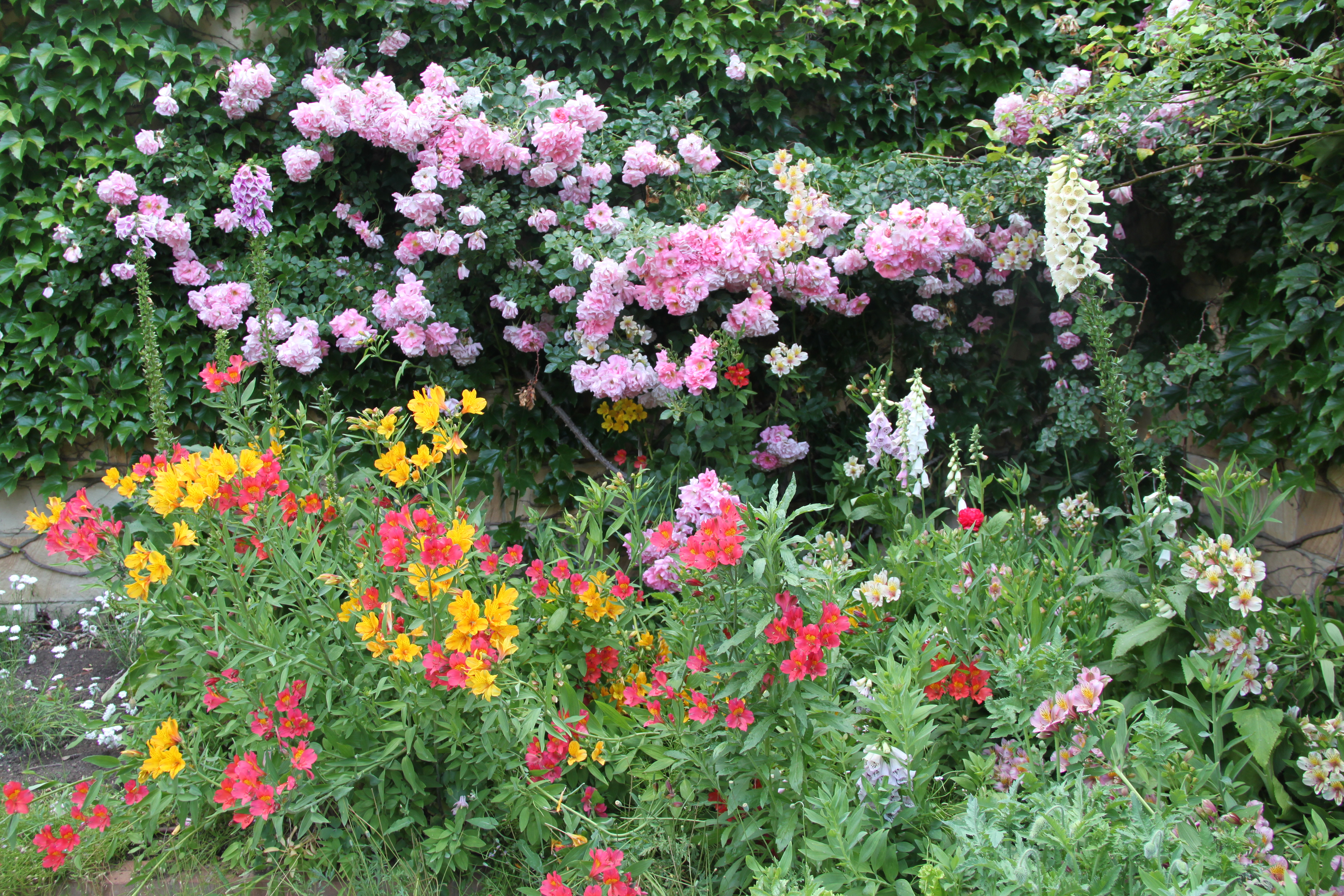
My Mum’s very floriferous garden in England, taken in June this year
But if we stick with flowers for the time, how do we find the best combinations of colours to make our overall design ‘sing’ to us?
I could probably fill a 20 tome series of books on using colour in the garden so I will just give four overriding tips here and then produce other articles over time focussing on how to make specific colour schemes work well.
1. Consider the ‘feel’ of the garden
Do you crave a peaceful, serene, relaxing space to step into, where you can leave everything else behind and just ‘be’? Or do you want to feel invigorated, energised, almost woken up by extreme, high impact surroundings? All gardens should be uplifting, but this can be achieved in many different ways.

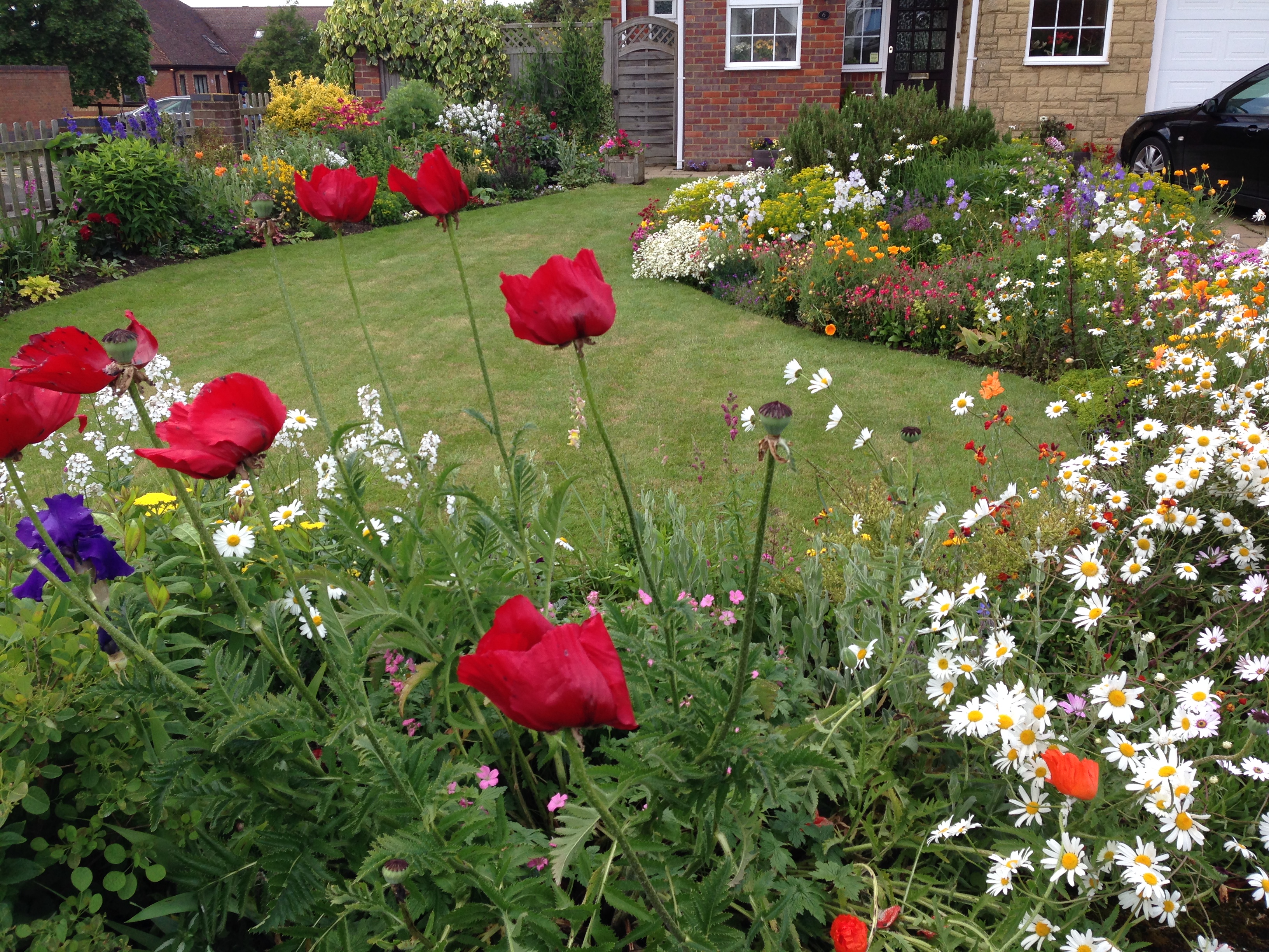
Mixed pastel colourings in the cottage garden beds at ‘Bowylie’ – these colours are very easy on the eye and hence relaxing to be around
On the whole, lighter, similar, pastel colours will be more relaxing whilst bright, bold, contrasting and shocking colours will be invigorating.

‘The Gardener’s Library’ at the MIFGS 2014 – red and white is an unusual colour combination. Some may find the red too jarring; others will love the richness and cheerfulness of it
2. Consider the style of the garden
Do you want your garden to have a very natural, organic, almost wild look about it? Is a formal, manicured, ‘designed’ look what really gets you going? Or do you prefer something in between?
Natural gardens need to look just that, which means either forgetting colour co-ordination completely, or better still, making it look as though you have paid no attention to it, whilst actually incorporating many colours that blend perfectly together.
On the other hand, some of the best formal gardens are very simple. The white garden at Sissinghurst would be a great example of this – neat hedges and a refined palette of purely white flowering plants. I am hoping to get to Sissinghurst next month so watch this space for some photos!

‘The Midnight Garden’ by Lisa Ellis at the MIFGS 2014. Orange is very much in fashion and the simple colour palette is very effective, producing quite a ‘designed’, sophisticated look
Best of all, look at lots and lots of photos of gardens – Pinterest is fantastic for this – and see which colours attract you most.
3. Observe the colour wheel
It is interesting that the Korean language is said to have five words for every one of our colour words. There are quite literally an infinite number of colours and when we say ‘purple’, what do we really mean by this? The burgundy purple foliage of Cotinus, the mid yellowish purple of ‘Bowles’ Mauve’ or the deep blue purple of Salvia?
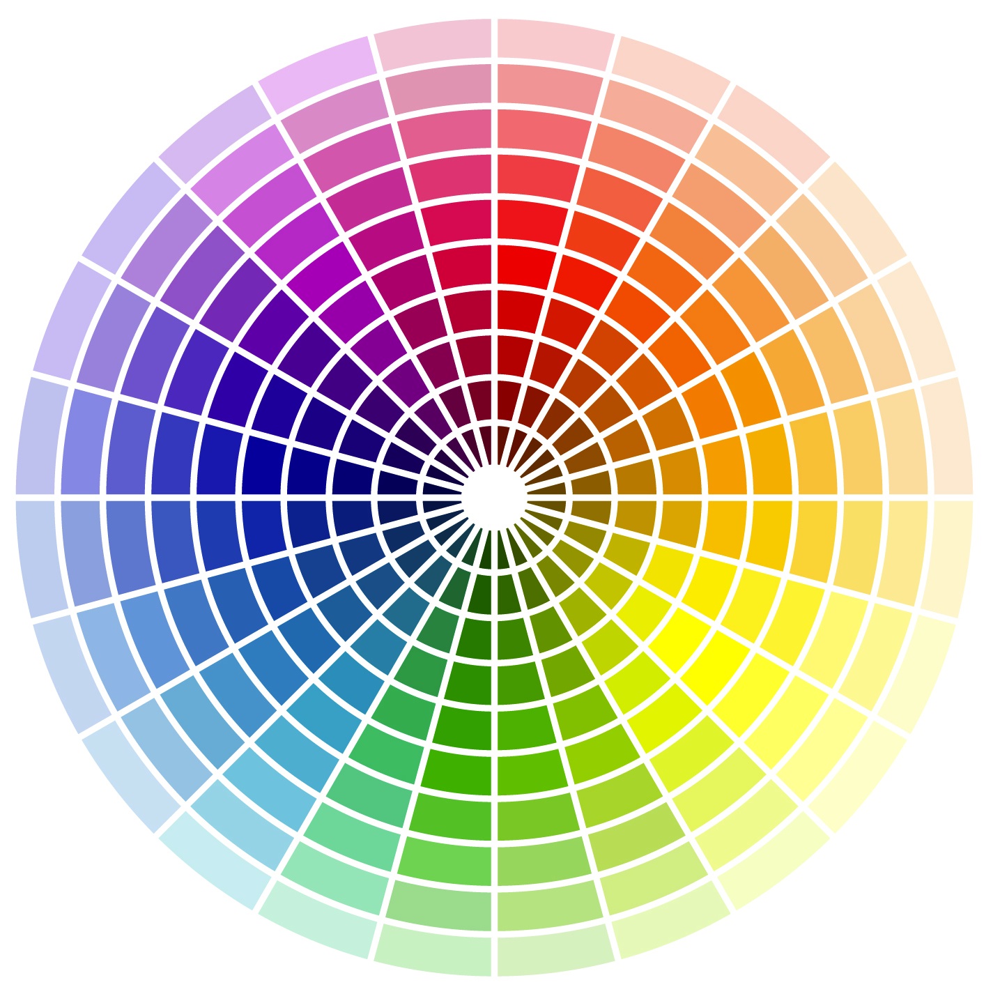
The best single tip I can give is to either work around the colour wheel (similar depths of colour) or along a spoke of the wheel (similar tones) but don’t pick from too many circles or spokes at the same time. So lots of pastels work well, as does mixing bold colours together and bold and pastel of the same tone is a lovely look. But if you just say ‘purple’ and then have a whole range of tones and shades it can quickly end up a mishmash of everything and nothing (I know this from hard learnt experience!).
A second tip is to be very careful with white. You will notice that it doesn’t feature on most colour wheels, or indeed on a rainbow. Many plants have white flowers, especially scented ones, and this is all to do with attracting pollinators, particularly nocturnal ones or for plants in dark, shady areas. But for such a ‘non-colour’ it has a huge effect on the overall look of a colour scheme. Just try grouping some plants at a nursery and seeing the difference when you add or subtract white flowers. Be very sure if it adds to or subtracts from your design.
Simple colour palette with no white. White would ‘sparkle’ and lift the overall composition but it would also considerably detract from the current soft, mellow feel
4. Be patient
I know, it’s hard. Believe me, I was not blessed with a patience gene. But you really don’t have much choice on this one, so it’s best to know that up front and try to embrace it! Even with the best research in the world, complex colour schemes take time to get right. It may look like colour #45835C on Google Images, but when you put it in your soil, under the particular light for your region and part of the garden, it may well be far more like colour #19287A.

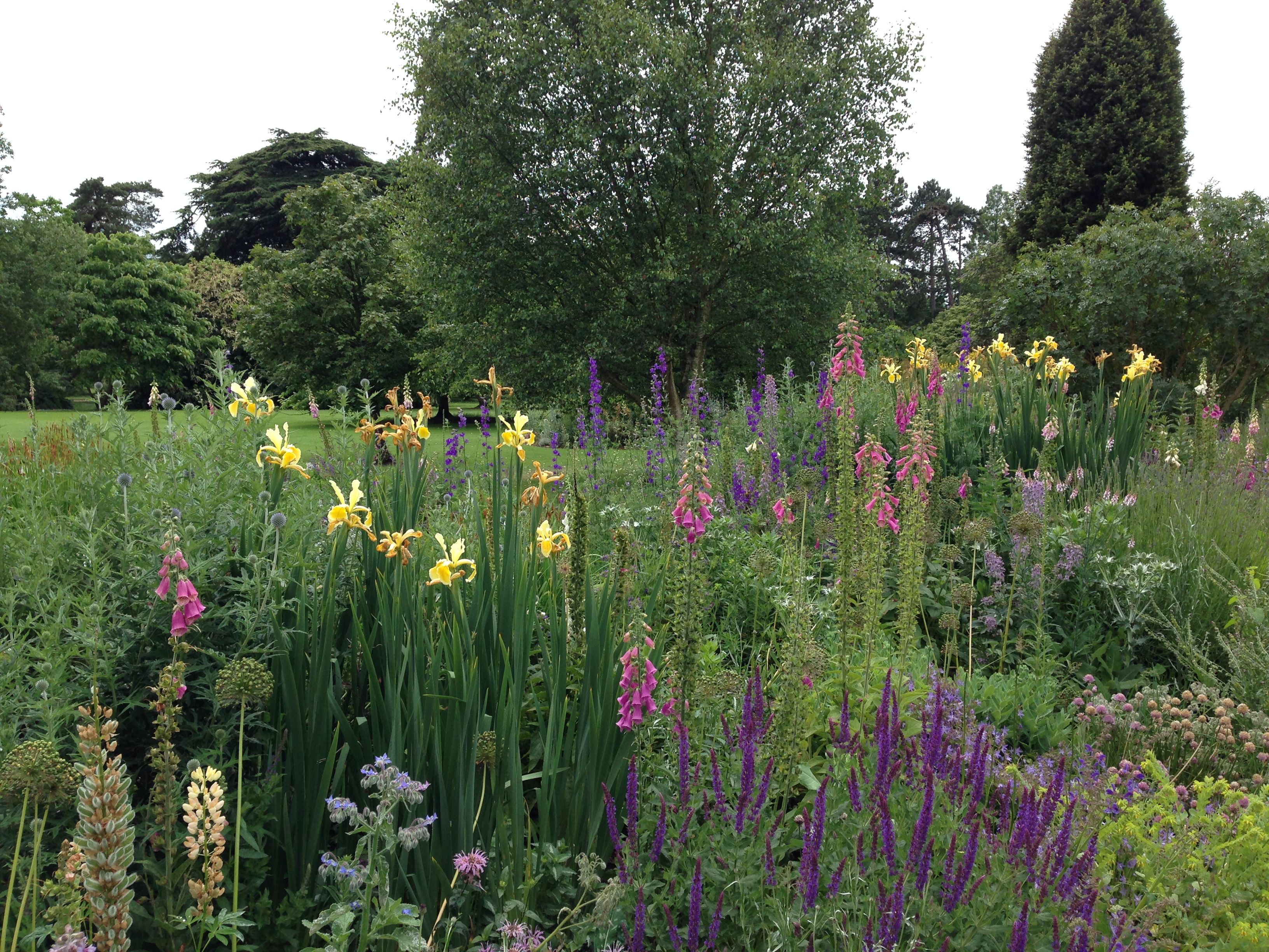
A perfect stands of lupins shown at the Chelsea Flower Show – high impact flower colours
However convinced you are, you will get some wrong and need to grovel with the nursery to exchange it, give it to a friend, or find a different spot in the garden, but that’s all part of the learning process. Buying plants in season, when you can see the plant in flower, requires discipline around timing but will eliminate many errors and is considerably less painful than diligently watering a plant for 11 months before realising it looks terrible! With a complex scheme you will get the occasional horror.
The saving grace is that usually the planning, thinking, watching and anticipation is far more exciting than achieving the perfect end product, so just experiment, learn and enjoy the ride!
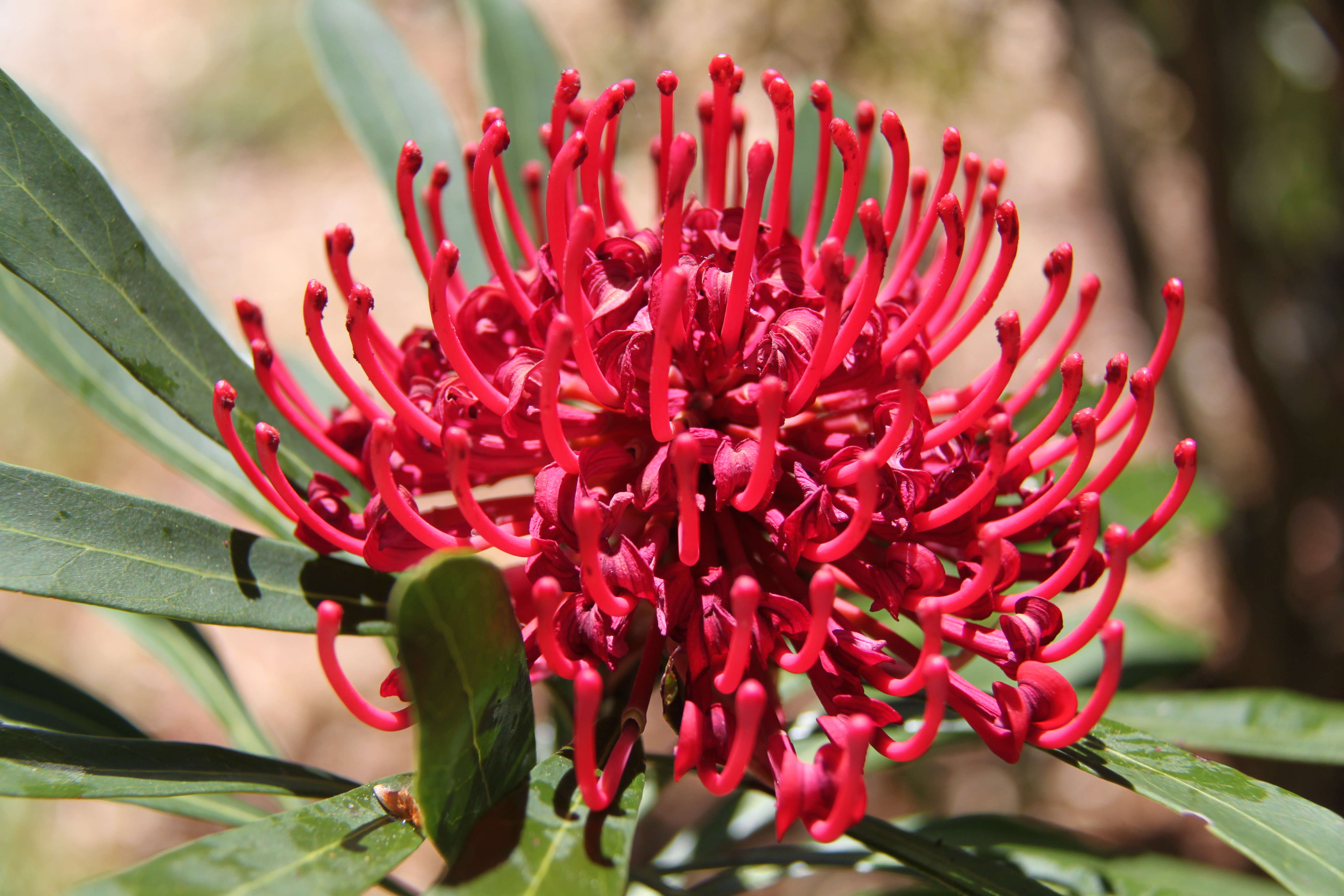
Telopea (waratah) flower; one of my favourites
If there is a particular colour scheme that you would like me to write about, just pop a comment below.

